Cosmodrift
Devlog 4 - Drifting in Style
Am I addicted to writing these the day they're due or something? Eh, I'm getting it done anyways. ok moving on now- Week 4! An excuse to talk about
g r a p h i c s
...so let's get right into it.
Cosmodrift has a... weird graphical style. The world is (or will be) split into different sections, each with a different colour to represent it. Instead of doing the normal thing and drawing coloured sprites for each section, I stubbornly implemented a way to ignore all that.
Firstly, I applied the Pixel Perfect Camera to the Main Camera. Usually, I'd show a gif of the result, but in this case, there's not much to show when it's working correctly. To summarise what the PPC does, it takes whatever the camera sees, and effectively snaps all the visible pixels to a grid. As difficult as the PPC can be to configure, the good thing is that once you configure it, you'll probably never need to touch it again.
Now, let's talk about colours. I like retro games, and you may have noticed in previous devlog gifs that the game is very visually inspired by consoles like the NES and the Gameboy. I wanted to implement a palette system for some reason I cannot remember, and I'd like to share the process.
So, you may or may not be familiar with POSTERIZATION, which is the process of limiting colours in an image, usually for artistic effect.
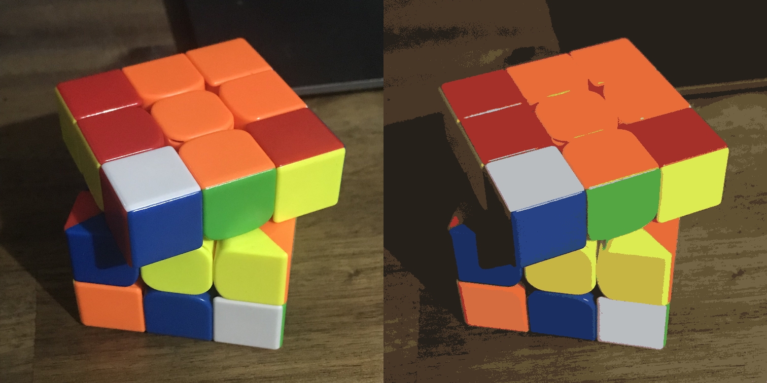
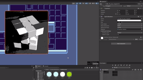
The picture on the left is a picture I took of a Rubik's cube. On the right is the posterized version, featuring a greatly reduced colour count of 16. For the graphics in my game, I applied a technique very similar to this. Below is a gif demonstrating the process.
Above, I apply a desaturation effect to greyscale the image, then I posterize it and reduce the colour count to 4. Now if you can believe it, this is actually everything I need to do outside of Unity. Of course, just plugging it into the engine leads to...
...which isn't ideal. Ignoring the fact that the resolution has been crunched, it doesn't really match the colours of the rest of the scene. This is where the Palette Shader enters the ring. I am not qualified enough to explain how this works, nor do I entirely understand it myself. To avoid injury to everyone's brain cells, I'll spare the complex explanation.
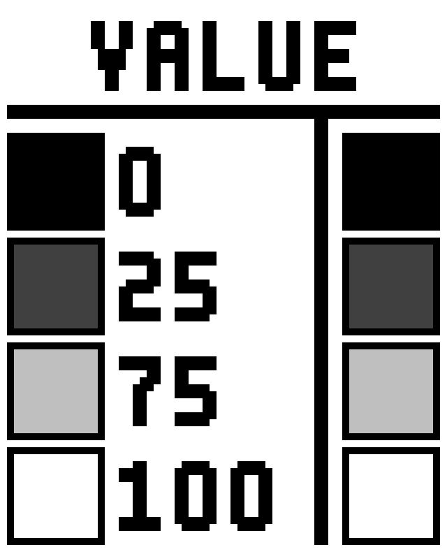
To sum up how the shader works though, it takes the sprite/texture, converts it to greyscale, and separates the image into 4 parts, specifically the pixels with values near 0, 25, 75 and 100. This creates masks for each of the four colours. By multiplying these masks with their corresponding colours, and adding the coloured masks together again, the sprite/texture has been coloured successfully! Enjoy this little graphic that doesn't really help with this explanation.
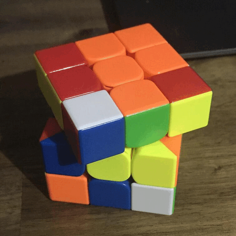
And with this, we can apply a material to the Rubik's cube sprite with this shader and voila!
Aaand that's it for this week! I may sound like a broken record, but I swear I'll start next weeks devlog earlier.
Leave a comment
Log in with itch.io to leave a comment.